The post How to Create a Contact Us Page for Business Websites? first appeared on Web Hosting Stuff.
]]>A well-designed Contact Us page is one of the most important elements of any business website. It acts as a direct bridge between you and your customers—helping them to get support, ask questions, request quotes, or connect for partnership opportunities. Yet, many businesses overlook this page and miss out on valuable leads simply because their contact section is incomplete, confusing, or hard to find.
In this guide, you’ll learn how to create a clean, user-friendly, and conversion-focused Contact Us page that builds trust and encourages action. Whether you run a small business, an e-commerce store, a service-based brand, or a local company, the steps outlined here will help you design a page that not only looks professional but also enhances customer engagement and strengthens your online credibility.
10 Essential Steps
1. Keep Your Page Simple & Clear
Your visitors shouldn’t struggle to find the right way to reach you. Make your Contact Us page easy to understand with:
- Clear heading (“Contact Us” or “Get in Touch”)
- Short description of what assistance you offer
- Clean layout with well-spaced sections
Tip: Avoid clutter and keep the design minimal.
2. Add Multiple Contact Methods
Different users prefer different communication channels. Include:
 Phone number
 Email address
 Office address or map location
 Live chat link / WhatsApp link
 Social media icons
This variety boosts accessibility and trust.
3. Use a Well-Designed Contact Form
A simple, short form increases the chances of getting more leads.
Essential fields include:
- Name
- Phone number (optional)
- Message box
- Subject/Inquiry type dropdown
- Best Practices:
- Keep fields minimal
- Add placeholder text
- Use proper validation
- Display success/error messages clearly
4. Add a Call-to-Action (CTA)
A CTA helps guide visitors toward the next step.
Examples:
- “Send Message”
- “Request a Callback”
- “Ask a Question”
- “Get Free Support”
Ensure the button is bold and easily visible.
5. Include a Map or Location Section
If your business has a physical office, embed a Google Map. It fosters trust and makes navigation easier.
6. Add Business Hours
Show the exact timing when you’re available.
Example:
Mon–Sat: 9 AM to 7 PM
Sunday: Closed
This small detail avoids misunderstandings and improves customer satisfaction.
7. Make the Page Mobile-Friendly
More than 60% of users access websites through mobile.
Your Contact Us page must load fast, look clean, and be easy to use on small screens.
8. Add FAQs Related to Contact
This helps reduce unnecessary queries and solves quick questions.
Example FAQs:
- How soon will you respond?
- Do you offer phone support?
- Can I request a demo or a quote?
9. Ensure Spam Protection
To avoid spam messages:
- Add Google reCAPTCHA
- Enable form validation
- Use server-side filtering
10. Test Before Publishing
Check:
- All links
- Email delivery
- Form submissions
- Mobile responsiveness
- Button clicks
Make sure every detail works smoothly.
Conclusion
A great Contact Us page fosters trust, enhances user experience, and increases customer engagement. By keeping it simple, adding multiple communication options, and designing a user-friendly form, you can make it easier for visitors to contact your business—and ultimately drive more conversions.
FAQ
1. Why is a Contact Us page important?
It provides customers with an easy way to reach you, improving trust, leads, and conversions.
2. What should I include on a Contact Us page?
Form, phone number, email, address, map, business hours, and social links.
3. Do all business websites needs a Contact Us page?
Yes—whether you run a local shop, service agency, or online store, communication is essential.
4. How many fields should a contact form have?
Keep it minimal: Name, email, and message are usually enough.
5. Can I add WhatsApp or live chat to my Contact Us page?
Absolutely. Modern customers prefer real-time support.
6. How do I make my Contact Us page more trustworthy?
Include your business address, map, phone number, company registration details, and social media links to show authenticity and transparency.
7. Should I use a contact form or show my email directly?
Use both. A contact form prevents spam, while displaying your email helps users who prefer sending detailed messages through their mailboxes.
8. How fast should I respond to inquiries submitted through the Contact Us form?
Ideally, within 24 hours. Quick responses improve customer satisfaction and conversion rates.
9. Can I automate replies from the Contact Us page?
Yes, you can set up:
- Auto-reply confirmation email
- Ticket system integration
- Chatbot suggestions
This assures users that their message was received.
10. Should I add department-wise contact options?
Yes, especially for medium to large-sized businesses.
Example:
- Sales
- Support
- Billing
- Partnerships
It ensures the inquiry reaches the right team quickly.
11. How can I reduce spam submissions?
Use:
- Google reCAPTCHA
- Honeypot fields
- Email verification
- IP blocking for repeated spammers
12. Is it necessary to include social media links on the Contact Us page?
Not mandatory but highly recommended. Social links provide an alternate communication channel and boost engagement.
13. Can I track the performance of my Contact Us page?
Yes, using tools like:
- Google Analytics
- Form submission tracking
- UTM tags on CTA buttons
This helps to measure conversion rates and user behavior.
14. Should I add an FAQ section directly on my Contact Us page?
Yes, a small FAQ section helps answer common questions and reduces the number of unnecessary inquiries.
15. What if I receive too many irrelevant inquiries?
You can:
- Add a dropdown for inquiry types
- Provide redirect links to relevant support pages
- Add clear instructions about what the form is for
16. Can I include file uploads in the contact form?
Yes, if your business requires documents like screenshots, ID proofs, or invoices. Always ensure file type and size restrictions
17. How do I improve the design of my Contact Us page?
Use:
- Good spacing
- Clean layout
- Icons for each contact method
- A simple color pattern matching your brand
- Bold CTA buttons
18. Should I add a testimonial or trust badge?
If your business deals with services, adding:
- Customer testimonials
- Ratings
- Certifications
This will increase credibility.
19. Is SEO important for a Contact Us page?
Yes. Optimizing it helps search engines display your business for queries like: “[Business name] contact number”, “support”, “location”, etc.
20. Can I embed WhatsApp Click-to-Chat on the page?
Absolutely. It increases real-time engagement, especially for local or small businesses.
The post How to Create a Contact Us Page for Business Websites? first appeared on Web Hosting Stuff.
]]>The post The Art of Choosing Color Schemes for Stunning Websites first appeared on Web Hosting Stuff.
]]>But with millions of possible combinations, how do you decide which palette truly works? Designers rely on principles of color theory, contrast, accessibility, and cultural meaning to craft schemes that not only look beautiful but also function effectively. From creating harmony and hierarchy to ensuring readability across devices, color selection is both an art and a science.
In this article, you’ll learn how to:
Understand the psychology behind colors and how they affect user perception.
Apply key color theory principles (hue, saturation, value, and contrast).
Build palettes using tools, trends, and tested design frameworks.
Avoid common pitfalls that can make a website overwhelming or inaccessible.
Perfect  Let’s pen down the article “The Art of Choosing Color Schemes for Stunning Websites” step-by-step guide with FAQ’s
The Art of Choosing Color Schemes for Stunning Websites
- Why Color Schemes Matter in Web Design
Colors are the first thing visitors notice. A well-chosen color palette creates mood, builds trust, and guides users’ attention to the most important parts of a website. Studies show that people form opinions about a brand within 90 seconds—and up to 90% of that judgment is based on color alone.
Emotional impact: Warm tones (red, orange, yellow) excite, while cool tones (blue, green, purple) calm.
Brand recognition: Consistent colors across the web and marketing materials help to boost recognition by 80%.
User experience: A poor palette can reduce readability and increase bounce rates.
- Understanding the Basics of Color Theory
Color theory provides the foundation for building harmonious palettes. Four key concepts every designer must know are:
Hue: The pure form of a color (e.g., red, green, blue).
Saturation: The intensity or vividness of a color; low saturation feels muted, high saturation feels bold.
Value: The lightness or darkness of a color; lighter values are airy, darker values are heavy and formal.
Contrast: The difference between two colors; good contrast ensures readability, especially for text.
 Example: A light background (high value) with dark text (low value) ensures maximum contrast for readability.
Read: How to Determine Your Website’s Content Posting Frequency?
- Color Psychology in Web Design
Colors influence user behavior and emotions:
Red: Energy, urgency, passion (used in sales buttons, food websites).
Blue: Trust, calm, professionalism (banking, SaaS, healthcare).
Green: Growth, nature, health (eco-brands, wellness).
Yellow: Optimism, attention (creative portfolios, e-commerce).
Black & White: Minimalism, luxury, or clarity.
Pro Tip: Match colors to your brand values. For example, a financial website using green may emphasize growth and stability, while tech platforms often rely on blue to reflect trust and intelligence.
- Frameworks for Choosing Color Palettes
Instead of guessing, use these proven frameworks:
Monochromatic: Variations of a single hue (clean and modern, easy to balance).
Analogous: Analogous color schemes use shades that sit side by side on the color wheel, creating a smooth, natural harmony that feels visually balanced and easy on the eyes
Complementary: Opposite colors (vibrant and high contrast).
Triadic: Three evenly spaced hues (balanced but lively).
Tetradic: Two complementary pairs (diverse, but requires careful balancing).
Example: An e-commerce site might use a triadic scheme of blue, red, and yellow—blue for trust, red for CTAs, and yellow for highlights.
- Accessibility and Usability Considerations
Great design is inclusive. Ensure color choices meet accessibility guidelines:
Contrast ratio: Aim for at least 4.5:1 for text vs. background.
Color blindness: 8% of men and 0.5% of women have color vision deficiency. Avoid using color alone to show meaning (e.g., pair colors with icons/labels).
Testing tools: Use platforms like Contrast Checker or Color Oracle to validate palettes.
- Tools & Resources for Designers
Modern tools make palette creation easier:
Colors: Generate palettes quickly.
Adobe Color: Explore complementary/analogous schemes.
Material UI Colors: Great for web/app UI.
Canva Color Wheel: Beginner-friendly.
AI-powered tools can also suggest palettes based on brand logos or uploaded images.
- Common Mistakes to Avoid
Overusing too many colors (stick to 3–5 main shades).
Poor text/background contrast.
Ignoring brand identity.
Copying trends blindly (instead of aligning with audience psychology).
- Real-World Examples of Stunning Color Schemes
Dropbox: Bold, playful gradients to reflect creativity.
Spotify: High-contrast black + green for modern, techy feel.
Airbnb: Warm coral palette for friendliness and comfort.
Apple: Minimal black & white with subtle accents for luxury.
- Conclusion: Turning Color into Conversion
Choosing a color scheme is not just a design decision—it’s a strategy. By applying color theory, psychology, accessibility principles, and modern tools, you can craft websites that are not only visually stunning but also emotionally engaging and conversion-focused.
Start with your brand identity, apply color theory, test for accessibility, and refine using AI tools. The right palette will make your website unforgettable.
Conclusion
Electing the right color choices will bring an appealing look to the website. It will boost the communication and create a brand image among users. Also, understanding the psychological impact of colors and their harmonious combinations, designers can craft stunning online experiences that resonate with their audience.
Read: How can I redesign my website without affecting SEO?
Frequently Asked Questions (FAQs)
- What is a website color scheme?
A website color scheme is a carefully chosen set of colors—usually 3 to 5 main shades—that define the look, feel, and brand identity of a website. It includes primary, secondary, and accent colors used across backgrounds, text, buttons, and graphics.
- What is the use of color theory in web design?
It allows creating harmony, contrast, and balance in visuals. It makes proper working of selected colors, improves readability, and influences user emotions in a proper manner that boosts conversions and brand trust.
- How can I understand which colors are best for my website?
Start with your brand identity and target audience. Use color psychology to choose a base color (e.g., blue for trust, green for growth), then add complementary or analogous colors for accents. Tools like Colors or Adobe Color can help you generate palettes.
- What are the common types of color schemes?
Monochromatic – variations of one hue.
Analogous schemes use shades that sit side-by-side on the color wheel, creating a naturally harmonious and visually pleasing effect. Complementary – opposite colors for strong contrast.
Triadic/Tetradic – three or four evenly spaced hues.
- How many colors should a website use?
Most professional websites use 3–5 main colors: one primary brand color, one or two secondary colors, and one or two accent/neutral shades for balance (like white, gray, or black).
- How do colors affect website visitors?
Colors impact emotions and decisions. For example, red can create urgency (often used in sales buttons), blue builds trust (common in finance/tech), and yellow sparks optimism (good for creative brands).
- How do I make my color scheme accessible?
Ensure good contrast ratios between text and background, avoid using color alone to convey meaning (add icons/labels), and test your site for color blindness compatibility using tools like *Contrast Checker* or Color Oracle.
- Can I change my website’s color scheme later?
Yes, but it’s best to keep changes gradual. Sudden, drastic shifts can confuse loyal users. If rebranding, maintain some familiar accents for continuity.
- What tools can help me create a color palette?
Popular tools include:
Colors (quick palette generator)
Adobe Color (advanced color wheel & harmony rules)
Canva Color Wheel (beginner-friendly)
Material UI Colors (great for app interfaces)
- Do color schemes impact SEO?
Indirectly, yes. While search engines don’t read colors, effective color schemes enhance user experience, readability, and engagement, which in turn lower bounce rates and improve SEO signals.
The post The Art of Choosing Color Schemes for Stunning Websites first appeared on Web Hosting Stuff.
]]>The post How to Determine Your Website’s Content Posting Frequency? first appeared on Web Hosting Stuff.
]]>“Post every day!” some experts say.
“Quality over quantity!” others argue.
“Three times a week is the sweet spot!” claim the rest.
With so much conflicting advice out there, it’s no wonder we’re all scratching our heads. The truth is, there’s no one-size-fits-all answer, and that’s exactly why I decided to dive deep into this topic.
After years of experimenting with different posting schedules (and yes, making plenty of mistakes along the way), I’ve learned that finding your ideal posting frequency is more like solving a personal puzzle than following a universal rule.
Whether you’re a busy entrepreneur trying to maintain your blog, a passionate writer building the platform, or a small business owner looking to boost your online presence, this guide will help you to find your content rhythm – without burning yourself out or disappointing your audience.
Read: How can I redesign my website without affecting SEO?
Why Content Posting Frequency Matters?
Content posting frequency is important for a multitude of reasons, and it impacts various aspects of a website or social media presence. Here’s a breakdown of why it matters:
1. Maintaining Audience Engagement:
- Consistency is Key:
- Regular posting keeps your audience engaged and coming back for more. If they know when to expect new content, they’re more likely to stay tuned.
- Sporadic posting can lead to audience disengagement and loss of interest.
- Building Relationships:
- Consistent interaction through content fosters a stronger connection with your audience, building trust and loyalty.
2. Boosting SEO:
- Fresh Content:
- Search engines favor websites that regularly publish fresh, relevant content. Consistent updates signal to search engines that your website is active and valuable.
- Increased Indexing:
- More frequent posting means more pages for search engines to index, which can improve your website’s visibility in search results.
3. Increasing Brand Awareness:
- Visibility:
- Regularly publishing content will increase the brand’s visibility online. The more content you post, the more people become aware of your brand.
- Establishing Authority:
- Consistent and high-quality content can establish your brand as an authority in your industry.
4. Driving Traffic:
- More Opportunities:
- Each new piece of content is an opportunity to drive traffic to your website or social media profiles.
- Sharing and Promotion:
- Regularly publishing content will give you more opportunities to share and promote your content across various channels.
5. Algorithm Factors:
- Social Media Algorithms:
- Social media algorithms often prioritize accounts that post consistently. Regular posting can increase your reach and visibility on social media platforms.
How Often Should I Post Content?
In short, the ideal website content posting frequency depends on:
- Your goals:
- SEO: More frequent, consistent posting.
- Audience engagement: Regular, predictable updates.
- Your resources:
- Prioritize quality over quantity.
- Your audience:
- Understand their expectations.
General guidelines:
- Blogs: 1-2 high-quality posts per week is a good starting point.
- Key takeaway: Consistency is more important than a specific number.
Essentially, find a sustainable rhythm that delivers valuable content to your audience.
List of Factors that Influence Posting Frequency
While deciding how often content should be done, various factors come into the picture. Each factor individually influences the strategy, making sure that it aligns with the goals and audience requirements. Check below for fewer pointers for main considerations:
- Goals: (SEO, engagement, leads)
- Audience: (Expectations, consumption habits)
- Resources: (Time, budget, manpower)
- Industry: (News, niche, trends)
- Content Quality: (Quality over quantity)
- Competition: (Competitor posting habits)
- Content Type: (Blog, video, social media)
- Platform Algorithms: (Social media reach)
- Analytics: (Performance data)
Prefer Quality over Quantity
Yet another important factor that is important to consider is quality. You can write all the time and post various pieces of new content every day. But more content posting doesn’t mean that it’s going to perform. When posting is crucial, then it also calls for quality. Publishing low-quality content will lead to hurting the credibility and SEO performance.
- Planning Ahead: You can consider using a content calendar to manage the topics and deadlines.
- Maintaining Standards: Incorporate an editorial process to make sure the piece is high quality.
- Revamping old content: You can audit and refresh outdated posts to maintain relevance.
It is compulsory to research the topics that are crucial to gain your audience. You can competitively write drafts, as other website also has similar content, so you need to write competitive content to make sure that your audience reads your content.
The post How to Determine Your Website’s Content Posting Frequency? first appeared on Web Hosting Stuff.
]]>The post Tips For Drupal SEO Modules first appeared on Web Hosting Stuff.
]]>How you can quickly harness the power of Drupal to get your site indexed and get top rankings in Search Engines.

Best 10 Drupal modules for website marketing
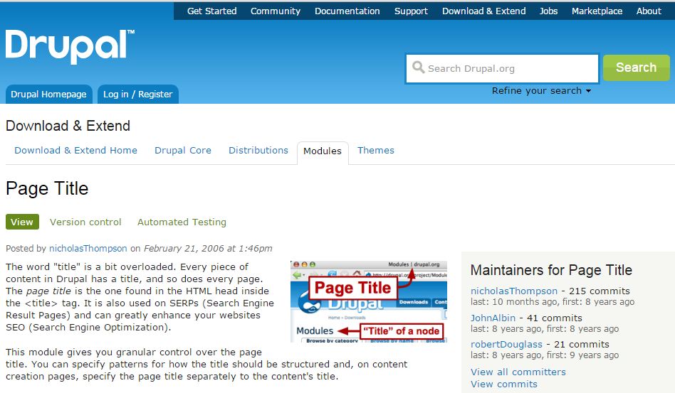
1) Page Title
You will Allows use to separate the page title from the content. The title given to a page is usually peppered with relevant keywords to attract maximum attention from search engines.
Click the Following Link and See how the page titles should be structured.
https://www.drupal.org/project/page_title
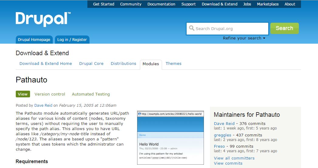
2) Pathauto
The Pathauto module to define patterns and automatically generate URLs based on these patterns. This module helps to generate optimized URLs that are highly SEO-friendly in nature.
For example,
Pathauto helps convert a Drupal-generated URL such as “mywebsite/node/15” into a more meaningful one like “hostripples.com/web-hosting/best-web“.
Click the Following Link and See how the Pathauto should be structured.
https://www.drupal.org/project/pathauto
3) XML Sitemap
XML Sitemap module will help search engine crawlers determine what new content is on your website, and what the paths are. Sitemaps are a listing of content on your website.
Click the Following Link and See how the XML Sitemap should be structured.
https://www.drupal.org/project/xmlsitemap

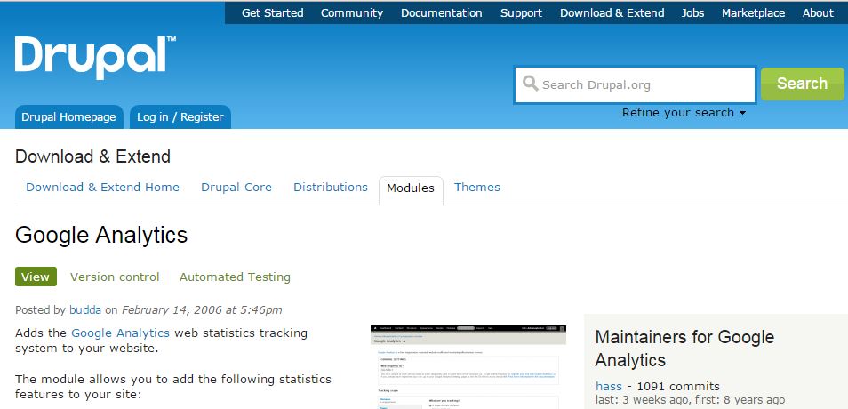
4) Google Analytics
This module will reports on who is visiting your website. You can see the top keywords for your site, your top entry and exit points, who is driving traffic to your site.
Click the Following Link and See how the Google Analytics should be structured.
https://www.drupal.org/project/google_analytics
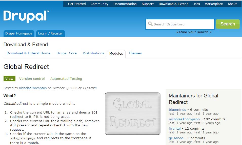
5) Global Redirect
Global Redirect module handles 301 redirects on your website automatically.
Click the Following Link and See how the Global Redirect should be structured.
https://www.drupal.org/project/globalredirect
6) Redirect :
Search engines hate pages that can be accessed two or more URLs. Get rid of duplicate URLs by using the Redirect module to explicitly redirect to useful links while getting rid of 404 error pages.
Click the Following Link and See how the Redirect should be structured.
https://www.drupal.org/project/redirect

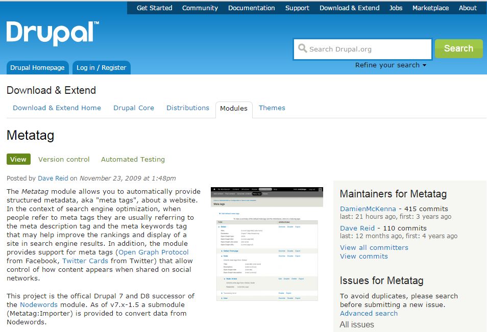
7) Metatag :
Metatag module define metadata on your content. This module is highly recommended to have Meta Descriptions on all content on your website. This module allows you to set some meta tags for each node, view or panels page.
Website can go nowhere without “Meta tags”, “Description”, “Page Title” or “Keywords”, Drupal has you covered! Each page you create can have their own share of meta tags to rise above other competing sites.
Click the Following Link and See how the Metatag be structured.
https://www.drupal.org/project/metatag
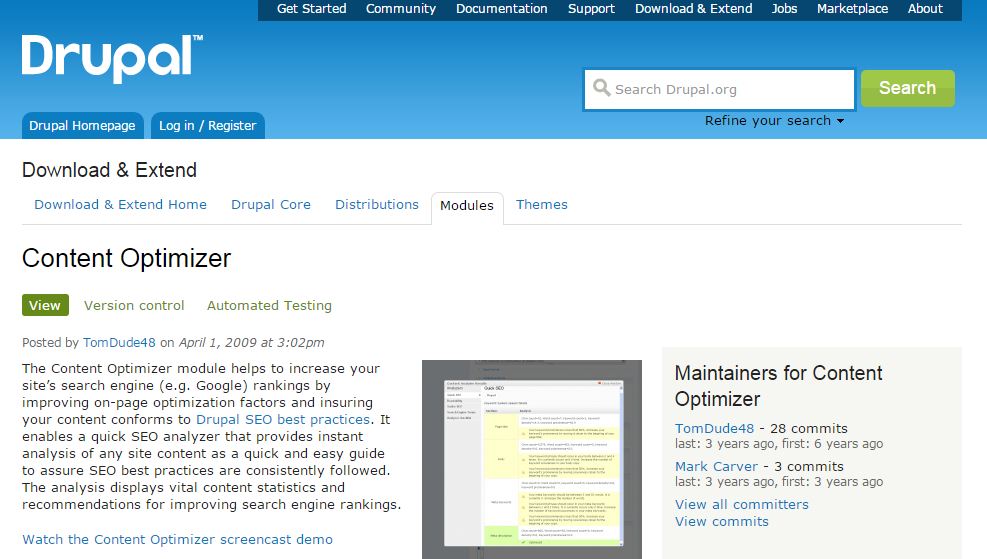
8) Content Optimizer :
Content Optimizer module will help monitor nodes within your site and provide useful tips on SEO best practices.
Click the Following Link and See how the Content Optimizer be structured.
https://www.drupal.org/project/contentoptimizer
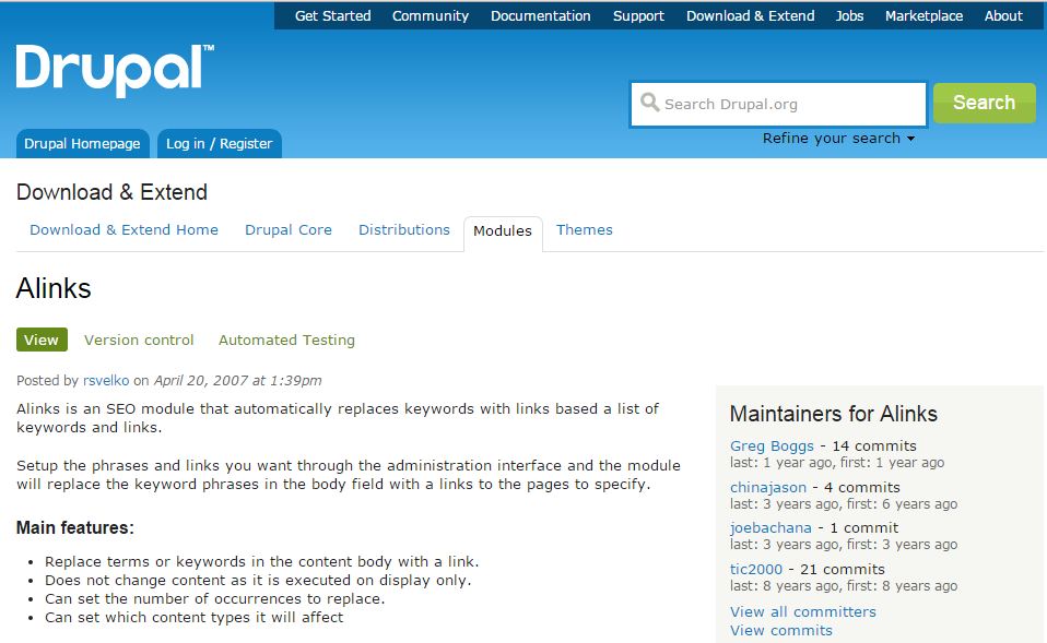
9) Alinks :
Alinks module will create automatic links. Allows users to associates defined text to links. This module is based on the wordpress module “alinks”. Very easy to use, just enter your normal content and setup the terms/links you want on your site through the administration interface.
Click the Following Link and See how the Alinks be structured.
https://www.drupal.org/project/alinks
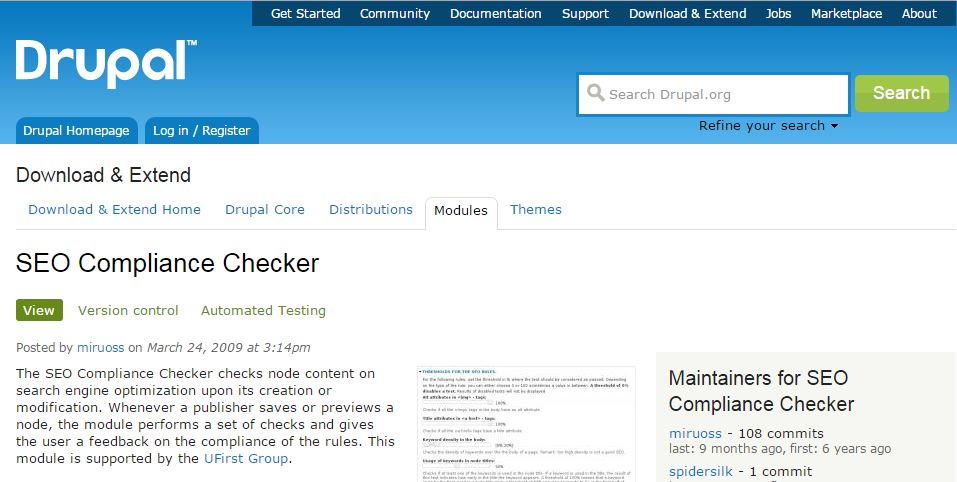
10) SEO Compliance Checker :
This module mainly checks for on page SEO. If a publisher saves or previews a node, the module performs a set of checks and gives the user a feedback on the compliance of the rules.
Click the Following Link and See how the SEO Compliance Checker be structured.
https://www.drupal.org/project/seo_checker
The post Tips For Drupal SEO Modules first appeared on Web Hosting Stuff.
]]>